 I love making grids with 2 inch squares but now, I'm experimenting with using the same colors and materials to create a larger piece of art. For this spread, I realized that having more space to work in made a huge difference in the outcome. The small squares had too much black in them but when I worked on a larger surface, I was able to change that and I think it's much more interesting.
I'm half way through my 8th grid sketchbook. Haven't found another obsession yet.
0 Comments
 These "Spirit Guides" creatures are now featured at the Denver Botanic Gardens. This one is over 10 feet and I loved the patterns on every surface of this imaginary animal.
Created by the workshop of Mexican artists Jacobo and María Ángeles, these brightly colored and richly patterned sculptures depict imaginary hybrid animals that act as both spirit guides and astrological embodiments of human character. Inspired by the Zapotec calendar, Spirit Guides is an unforgettable outdoor experience reminding us of the profound connections that bind us to the inhabitants of the natural (and cosmological) world.  Denver's Cherry Creek Art Festival is one of the premier festivals for artists in the country. It's really hard to be juried in so the artists who exhibit are among the best in the country.
I always go hoping to discover new fiber artists and this weekend, I did! I had a chance to chat with Camille McMurry about her creative process. She is also a Denver fiber artist like myself but what impressed me was the large scale of her pieces. Her compositions were interesting and her color palette was intriguing. She is also skilled at weaving and incorporating different textures in her work. I look forward to seeing more of her work.  I'm still working on this series and here is my latest composition. I'm enjoying the layering and final contrast with black stenciling.
 This is one of the pieces I donated to the Rocky Mountain Quilt Musuem fund-raising auction this year.
The fabric is made from a watercolor piece I painted and sent to Spoonflower to be printed on fabric. Then, I hand embroidered all the stitches on top. I hope it raises some serious money for this museum. 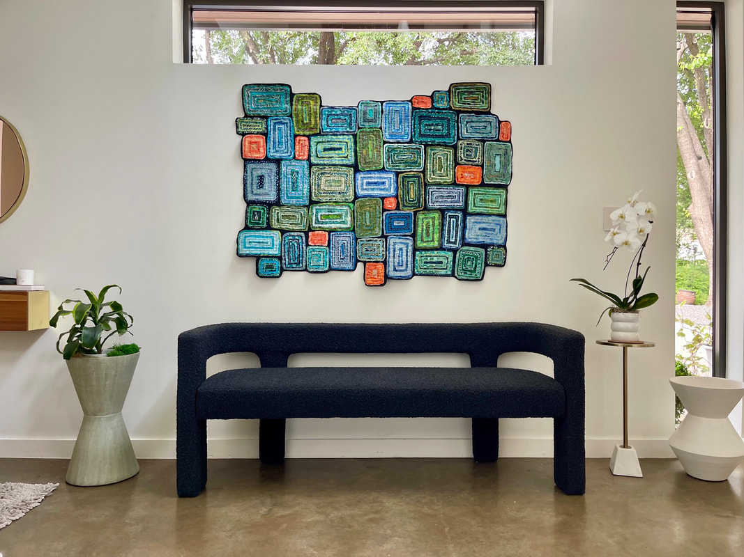 It's not often I have a photo of my art hanging in a home but when my step son and daughter-in-law came to visit me in my studio, they saw this piece and asked if I would give it to them. They said they had the perfect spot to hang it. It is a large piece called Tribal Dance and now that I see it on the wall, I would have made it even larger to fit that space, given the size of the bench.
But seeing it from afar, I'm so glad I added the orange to an otherwise blue palette. These complimentary colors really make everything pop. And, I'm also happy it is not hung where sunlight will fade the fabrics. Having the windows on the top and side will give it enough light to see the piece without damaging it. I can't wait to see it in person! 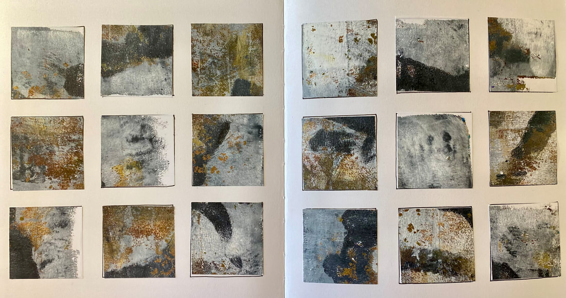 My continuing series on grids. This time, instead of painting directly on the sketchbook, I'm cutting up pieces of gel printing pages I've made before and re-arranging them on the grid. I love this since it gies me even more ideas for making compositions.
 This week, I'm working in my sketchbook doing some gel plate mono printing. It is challenging working in a spiral bound book but I like the idea of all my prints being seen page after page.
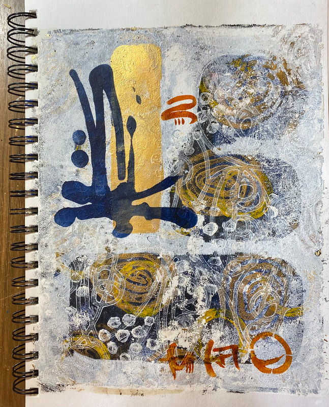
I'm also adding multiple layers using masks to block out areas I want preserved from ne layer to the next. Making paper stencils as well to add blocks of paint (gold) as well as commercial stencils to create focal points and textural interest. Covering dark layers with light layers is a concept that is new to me since I'm used to working light to dark. This piece also uses up the last of my favorite color: Golden Nickel Azo Gold. Golden discontinued this paint and that makes me sad! 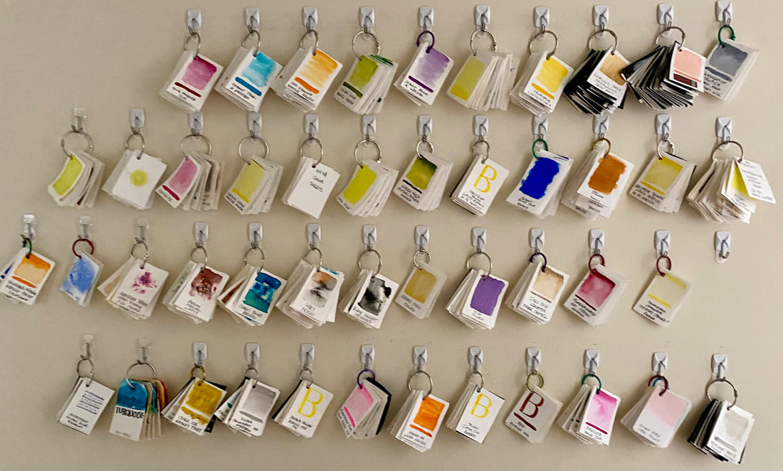 This is another way I Swatch my colors and hang them on a wall. But I've found this system less helpful since I never use them! Each one of these bundles represents one companies paints or water color. I DO like looking at the wall! I will always swatch new paints as they are changing all the time and I really just like the process.
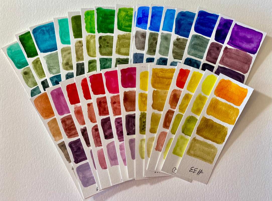 I used to swatch my paints with the color that came out of the tube, or from the jar, or the "pure" color. but now, I am trying to satch colors to tone down or lighten the colors to see what other colors I can get that are not"pure" but mixedith something different. For this series of watercolor swatches, I swatched the pure color, added brown, added Paynes gray and then added white. It's amazing what you can mix to get new colors from a few tubes of paint!
It's no wonder that some artists spend their entire lives studying color. You can read tons of books about how to get the perfect color from your paints but actually doing it, makes all the difference. |